
Did you know you can make your Power BI dashboards more engaging by adding icons directly with DAX measures?
The trick is to use the UNICHAR() function in Power BI, which allows you to display Unicode characters (like ✅, ❌, ▲, ▼, and ⭐) inside your visuals.
This method is lightweight, flexible, and doesn’t require custom visuals, making it perfect for creating professional Power BI reports that stand out.
What is the UNICHAR() Function in Power BI?
The UNICHAR() function in DAX returns a Unicode character based on the numeric code you provide.
For example:
UNICHAR(9989)→ ✅UNICHAR(10060)→ ❌UNICHAR(9650)→ ▲UNICHAR(9660)→ ▼
You can easily find Unicode character codes online (e.g., search for Unicode check mark code or use this reference) and use them in Power BI.
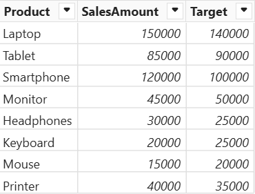
Sample Dataset
Step 1: Create a DAX Measure with Icons
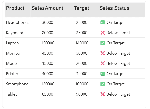
Let’s say you want to display a check mark (✅) if sales are above target and a cross (❌) if not.
Here’s how to write the measure:
Sales Status =
IF(
    SUM(Sales[SalesAmount]) >= SUM(Sales[Target]),
    UNICHAR(9989),
    UNICHAR(10060)
)
Step 2: Use the Measure in a Table or Matrix
Add the Sales Status measure to a Table or Matrix visual.
Power BI will display either ✅ or ❌ for each product row.
You can even combine text with icons for better readability:
Sales with Icon =
IF(
    SUM(Sales[SalesAmount]) >= SUM(Sales[Target]),
    UNICHAR(10003) & " On Target",
    UNICHAR(10060) & " Below Target"
)
Why Use UNICHAR() in Power BI Reports?
Enhances data visualization: Quickly show performance status with icons.
No custom visuals needed: Works directly with built-in Power BI visuals.
Highly customizable: Mix icons with text or apply conditional formatting.
Improves user experience: Makes reports more interactive and easier to interpret.
Example Use Cases
▲ / ▼ for trend direction
⭐ for customer ratings or reviews
🔺 / 🔻 for KPI changes (growth vs. decline)