
Transform 16+ Redundant Power BI Visuals Into One Dynamic Chart Using Field Parameters
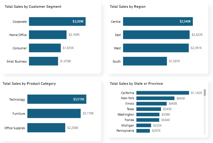
The problem becomes more obvious when you go beyond a single KPI. Once you add measures like Total Quantity, Total Orders, and Total Profit. Very quickly, you end up with 16 or more charts that are essentially repeating the same analysis.
As a result, reports become bloated, dashboard space is wasted, performance can degrade, and users are forced to navigate through unnecessary visuals.
The Solution: Power BI Field Parameters!
Power BI Field Parameter is a feature that allows you to create dynamic charts that users can reconfigure themselves.
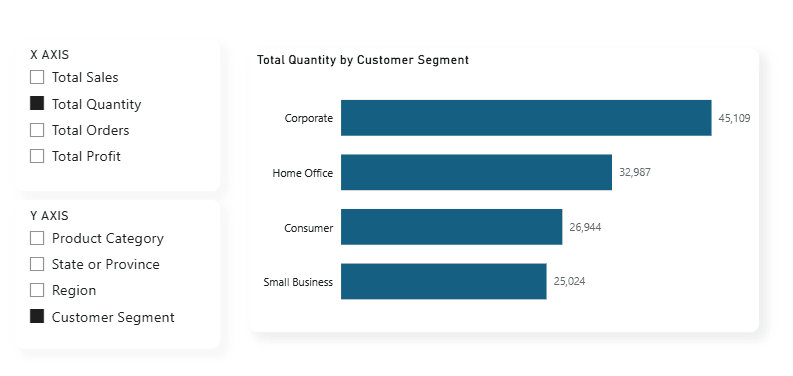
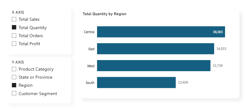
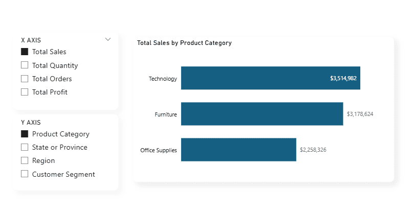
Instead of those four separate Power BI charts above, you'd have one dynamic Power BI visual with two Power BI slicers. Users select their dimension, and the Power BI chart updates instantly.
How to Set up Field Parameter
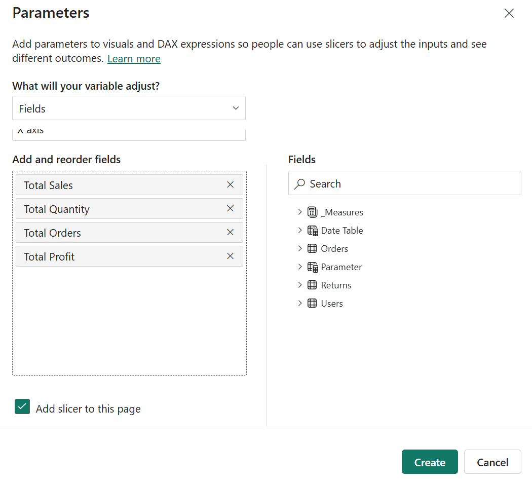
Step 1: Create Your Y-Axis Field Parameter in Power BI
Navigate to Modeling tab > New Parameter > Fields in Power BI Desktop
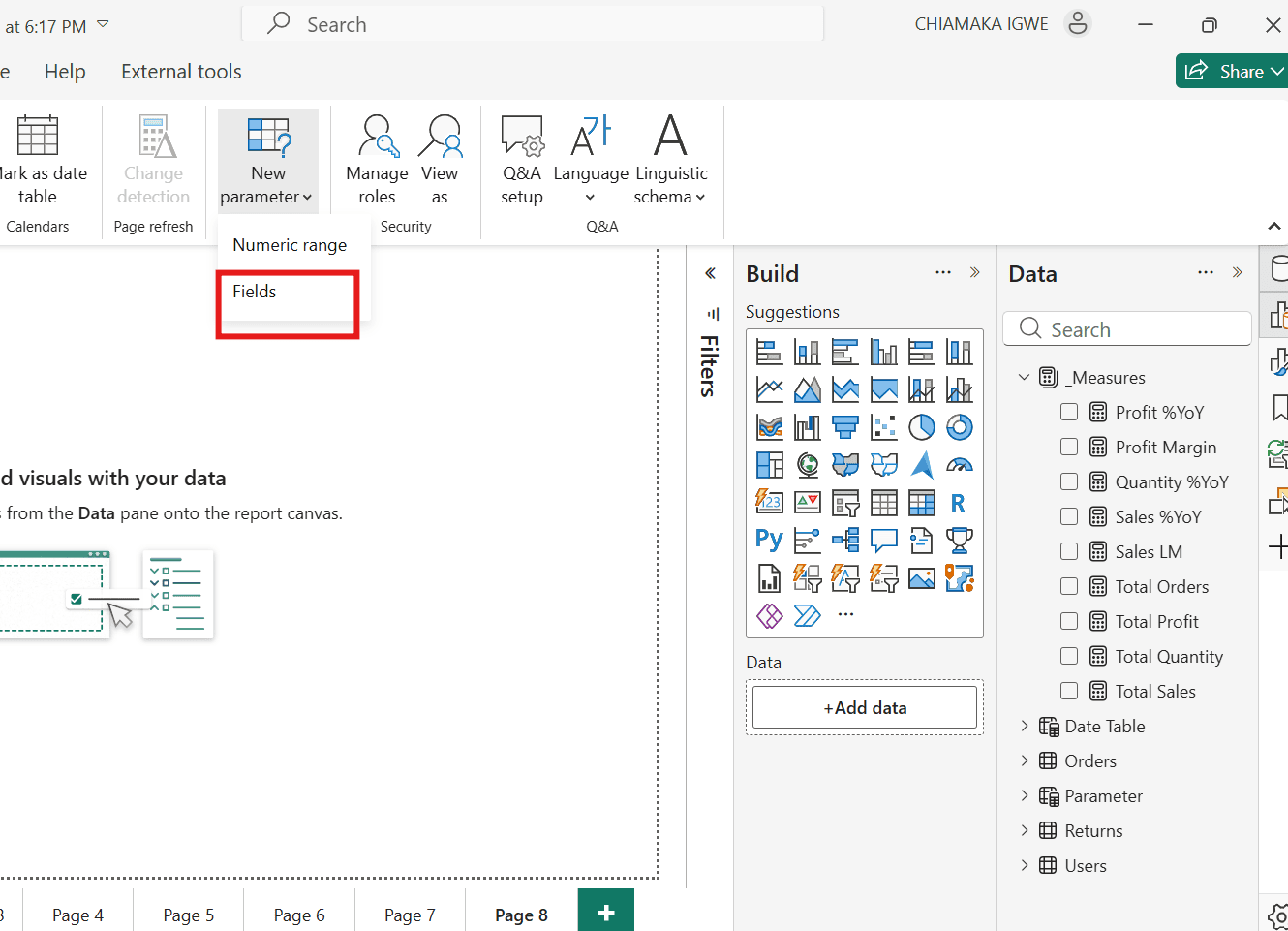
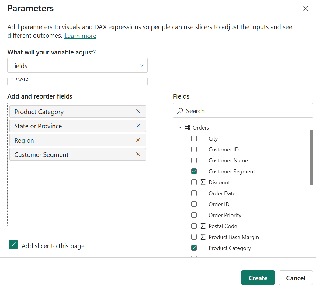
- Name it "Y AXIS"
- Select the dimensions for your Power BI report: Product Category, State or Province, Region, Customer Segment
- Check "Add slicer to this page" to create a Power BI slicer
- Click Create
Power BI automatically generates your field parameter and adds a slicer to your Power BI report page.
Step 2: Create Your X-Axis Field Parameter in Power BI
Repeat the process for your Power BI measures:
- Create another Power BI Field Parameter
- Name it "X AXIS"
- Add your DAX measures: Total Sales, Total Quantity, Total Orders, Total Profit
- Check "Add slicer to this page" for Power BI slicer functionality
- Click Create
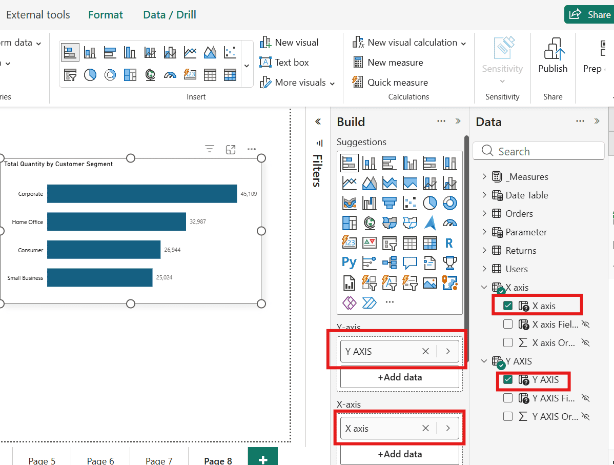
Step 3: Build Your Dynamic Power BI Chart
Add a Power BI bar chart to your canvas. Instead of using regular fields:
- Drag the "Y AXIS" field parameter to your Power BI visual's Y-axis
- Drag the "X AXIS" field parameter to the Values well
Your Power BI chart is now completely dynamic and interactive.
How Power BI Field Parameters Work
One Power BI visual. Multiple analytics combinations. No Power BI bookmarks, no complex DAX code, no custom navigation.

Benefits of Using Power BI Field Parameters
Better Power BI Performance - Fewer visuals mean faster Power BI report loading times and improved Power BI dashboard performance
Easier Power BI Report Maintenance - Update formatting once instead of across 15+ Power BI charts
Improved Power BI User Experience - Users control their analysis without scrolling through multiple Power BI report pages
Reduced Power BI Development Time - Build one dynamic Power BI visual instead of many static ones
Enhanced Power BI Analytics - Users explore data combinations you might not have anticipated
Final Thoughts
Final Thoughts
Get Expert Help Optimizing Your Power BI Reports
Get Expert Help Optimizing Your Power BI Reports
- Power BI Performance Optimization - Speed up slow reports and dashboards
- Data Model Restructuring - Build efficient star schemas and reduce data model size
- DAX Optimization - Replace inefficient calculations with best-practice measures
- Report Design Overhaul - Apply UX principles to create intuitive dashboards
- Team Training - Teach your developers Power BI best practices